Your Ultimate Guide to LinkedIn Post Specs


If you're posting a standard image on LinkedIn, the magic numbers are 1200 x 627 pixels. Sticking to this 1.91:1 aspect ratio is the best way to make sure your image shows up perfectly in the feed, without any weird or awkward cropping. Getting this right is a simple step that makes a huge difference in your first impression.
Why LinkedIn Post Specs Matter
Following the right specs for your LinkedIn posts isn't just about ticking a technical box—it's a core part of a smart content strategy. When your visuals are sized correctly, they look sharp and clear on every device, from a desktop monitor to a smartphone screen.
This professional polish is what separates content that gets scrolled past from content that stops the scroll. People are far more likely to engage with something that looks good and is easy to take in.
For a quick reference, this visual summary breaks down the most important specs you need to know.
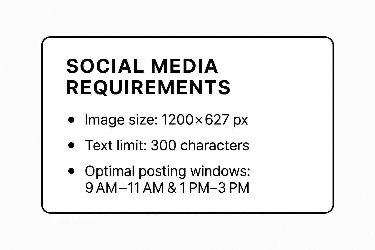
As the infographic shows, getting a handle on just a few key numbers—like the go-to 1200 x 627 px for images—is the foundation for creating posts that actually perform.
Key Benefits of Following The Guidelines
So, why obsess over these numbers? The payoff is real and directly ties into how well your content works on the platform.
- Look More Professional: When your images and videos are sized correctly, it sends a signal that you pay attention to detail. This small thing instantly boosts your brand’s credibility.
- Give a Better User Experience: Nobody likes squinting at cropped text or a cut-off picture. Content that fits the feed perfectly is just easier and more enjoyable for your audience to consume.
- Boost Your Visibility: LinkedIn's algorithm often rewards native content that is properly optimized for the platform. This can mean your posts get shown to more people.
In the end, knowing these specs isn't just about following rules; it's the first step to building a content plan that gets results.
Getting Your LinkedIn Images Just Right
Let's be honest, visuals are what stop the scroll on LinkedIn. Getting your image specs right isn't just a technical box to check; it’s a direct reflection of your brand's quality and attention to detail.
When an image is blurry, awkwardly cropped, or pixelated, it cheapens your message. The platform’s feed is designed to showcase well-formatted content, so sticking to the rules ensures your visuals look sharp and professional every time.
Single Image Post Dimensions
For a standard single image post, the sweet spot is 1200 x 627 pixels. This creates a 1.91:1 aspect ratio, which is what LinkedIn uses for shared link previews. It’s a safe, reliable choice that looks great across both desktop and mobile feeds.
That said, don't sleep on square images. A 1:1 aspect ratio (think 1080 x 1080 pixels) is a powerhouse on mobile. It takes up more vertical real estate in the feed, making it much harder for users to just scroll past. The choice really comes down to your image content and what you want to achieve. For a more detailed breakdown, our guide on optimizing your LinkedIn post image size has you covered.
Pro Tip: While LinkedIn accepts JPGs, PNGs, and non-animated GIFs, I always recommend using PNGs for anything with text or fine details, like charts or infographics. Exporting as a high-resolution PNG helps maintain that crisp, professional look and avoids any unwanted compression artifacts.
File Formats and Size Limits
Beyond the dimensions, you also need to keep an eye on the technical details of the file itself. LinkedIn is pretty specific about what it will and won't accept.
- Supported Formats: You can upload JPG, PNG, and GIF files. Just a heads-up, animated GIFs won't play in a standard image post; LinkedIn will just display the first frame as a static image.
- Maximum File Size: Your image file needs to be under 5 MB. If it's too large, you'll need to compress it. Most image editing tools have an "Export for Web" option that does a great job of reducing file size without a noticeable drop in quality.
Following these specs isn't just for show—it genuinely impacts your results. It's a well-known fact that posts with images get significantly more attention. In fact, data shows that LinkedIn posts with images receive a staggering 98% more comments than text-only posts. As this research from Buffer on LinkedIn engagement highlights, getting your visuals right is one of the easiest ways to start more conversations and make your content perform better.
Getting Your Video Content Just Right
Video is an absolute powerhouse for grabbing attention on LinkedIn. But if you don't get the technical details right, all that creative effort can go to waste. Sticking to LinkedIn's video specs means your content will play perfectly, look sharp, and save you the headache of upload errors.
Let's start with file size. Your video needs to be at least 75 KB, but you have a lot of room to play with, as the maximum size is a hefty 200 MB. This gives you plenty of flexibility, whether you're posting a quick, unedited clip or a highly polished marketing video.
Essential Video File Specifications
First things first: format. LinkedIn plays nicely with several common video formats, including MP4, AVI, and MOV. From my experience, MP4 is almost always the best bet. It delivers great quality without creating a massive file, making it ideal for web uploads.
Next up is video length. You can upload native videos that are anywhere from 3 seconds to 10 minutes long. Having ten minutes available is great for deep-dive tutorials or interviews, but don't feel like you need to use it all. The sweet spot for engagement is usually under two minutes—long enough to deliver value, but short enough to hold a viewer's attention in a fast-scrolling feed.
Mastering Resolution and Aspect Ratio
How your video looks is all about its resolution and aspect ratio. LinkedIn supports a huge range of resolutions, from a tiny 256x144 pixels all the way up to a massive 4096x2304 pixels. For most purposes, aiming for 1080p (1920x1080 pixels) is a safe and effective choice. It looks crisp and professional on any screen.
The aspect ratio—the shape of your video—is just as important. The standard widescreen 16:9 works fine, but other formats can give you an edge.
- Square (1:1): I'm a big fan of the square format. It takes up more real estate on a mobile screen, which can literally stop people from scrolling past your post.
- Vertical (9:16): If you're creating content specifically for mobile, vertical video offers a full-screen, immersive experience that's hard to beat.
The best aspect ratio really comes down to your content and how you expect your audience to view it.
Video is a non-negotiable part of a modern LinkedIn strategy. It’s not just about engagement; it’s about creating a human connection. A well-produced video that follows the platform’s specs can communicate personality and expertise in a way text and images simply can’t.
The numbers back this up. Video posts typically see five times more engagement than simple text updates, making them a must-use for anyone trying to expand their reach. And if you're really looking to boost interaction, live video generates 24 times more comments than pre-recorded videos. You can dig into more of these powerful insights on LinkedIn engagement from Buffer to help shape your strategy.
If you need a walkthrough on the process, we have a complete guide on how to post a video on LinkedIn.
Getting the Most Out of Document and Carousel Posts
Document posts, which many of us know as carousels, are one of the most powerful tools in your LinkedIn toolkit. They let you share rich, multi-page content like presentations, case studies, or how-to guides directly in the feed. People can swipe through them without leaving the platform, which is a huge win for keeping their attention.
Before you start creating, you need to know the technical specs. Getting these right from the start saves a lot of headaches later.
- Supported File Types: LinkedIn is pretty flexible here. You can use PDF, PPT, PPTX, DOC, and DOCX files.
- File Size Limit: Keep your file under 100 MB.
- Page Count: You have a generous limit of up to 300 pages.
With these limits, you can easily share some really substantial content. Think detailed industry reports, in-depth portfolios, or even a full presentation deck from a recent talk.
Designing Carousels That People Actually Read
Knowing the specs is one thing; designing a carousel that stops the scroll is another. The key is to make it visually engaging and easy to digest. Your first slide is everything—it's your hook, so make it count.
Think of each slide as a standalone piece of a larger puzzle. It needs to be clear and compelling on its own but also make sense in the sequence. I always recommend using a consistent brand style, readable fonts, and high-quality images or icons to break up text. For instance, a software company could create a 12-slide carousel that walks through a new feature, using a mix of screenshots, bold statistics, and short, punchy text on each slide.
The goal is to tell a compelling story. Each slide should build on the last, guiding your audience through a narrative. And don't forget the final slide! It must have a clear call-to-action that tells people what you want them to do next, whether that's visiting your website, commenting, or sending you a message.
If you want a complete walkthrough of the process, check out our guide on how to post a carousel on LinkedIn. It covers everything step-by-step. By matching the right technical specs with smart design, you can turn a simple document post into a serious engagement driver for your profile or page.
Maximizing Reach with Text and Articles

While flashy visuals are great for stopping the scroll, your words are what truly deliver the message and spark conversation. Getting the specifications right for text-based content is crucial, whether you’re posting a quick thought or a deep-dive article.
For a standard post—from either your personal profile or a Company Page—you have a generous 3,000 characters to work with. But here's the catch: LinkedIn hides anything after roughly 210 characters behind a "see more" link. That means your opening lines absolutely have to be compelling enough to make someone click.
Good structure is non-negotiable for holding a reader's attention. Break up walls of text with short paragraphs, bullet points, or even the occasional emoji. This makes your content far easier to scan and digest, especially since most people will be reading on their phones.
The Power of LinkedIn Articles
When you have more to say, LinkedIn Articles are your best friend. Think of them as blog posts that live right on the platform, offering far more room and better formatting than a simple status update.
- Headline: Your title is limited to 100 characters. Make it sharp, clear, and intriguing to earn that click.
- Body Content: Here, you can really stretch out. The body of an article allows for over 120,000 characters.
- Media: You can embed images, videos, and links throughout the article, creating a much richer experience for your reader.
LinkedIn Articles are fantastic for building your reputation as an expert. They stick around much longer than posts in the feed and even get indexed by search engines, meaning people can find your insights weeks or months later.
To get even more mileage out of your best articles, think about repurposing them. For instance, you can find simple strategies to turn articles into podcasts and reach a whole new audience that prefers listening over reading.
Finally, don't forget to boost your post's visibility. Use relevant hashtags and tag any people or companies you mention. This is how you get your content in front of a targeted audience well beyond your existing network.
Why Bother with LinkedIn's Specs? It's All About Your Success
Let's be honest, digging into technical specs can feel like a chore. But when it comes to LinkedIn, getting the details right is one of the smartest things you can do to make your content work harder for you. It's not just about ticking a box; it's a core part of a winning content strategy.
When you format your images, videos, and documents correctly, they show up perfectly on every device—desktop, tablet, or phone. This means no weird cropping, blurry images, or other visual glitches that can make your brand look sloppy and unprofessional. That small bit of effort signals quality and respect for your audience's time.
The Algorithm Cares, and So Should You
The LinkedIn algorithm is built to reward content that gives users a good experience. Posts that fit the platform's native specs are, by definition, easier and more pleasant to view. This makes them more likely to get an initial boost in visibility. For a deeper dive, getting the social media algorithm explained can really clarify why these technical details matter so much.
This boost isn't just a vanity metric. It creates a powerful snowball effect. When your optimized post gets that initial push, it leads to more early engagement. Those likes, comments, and shares tell the algorithm your content is valuable, which prompts it to show your post to an even wider audience.
Following technical guidelines isn't about appeasing a machine; it’s about respecting your audience's time and attention. When you deliver a seamless viewing experience, you remove friction and make it easier for people to absorb and respond to your ideas.
Turning Technical Details into Real-World Performance
So, how does this translate into actual numbers? The link between following the rules and seeing results is crystal clear. LinkedIn boasts an average engagement rate of 2.8% across all posts, which is quite a bit higher than what you'll find on most other social platforms.
Some industries do even better. For instance, the Construction and Manufacturing sectors often see engagement rates around 4%, while the Technology industry pulls a strong 3.6%. You can find more of these kinds of insights from industry-specific engagement on Hootsuite.
The takeaway is simple: meeting the correct linkedin post specs is more than just about looking good. It's a strategic move that directly impacts how many people see and engage with your content. You're not just following rules; you're setting yourself up for better reach, more meaningful conversations, and a stronger professional brand.
Common Questions About LinkedIn Post Specs
Even seasoned marketers run into questions about LinkedIn's technical requirements. Let's clear up some of the most common ones so you can post with confidence.
What Happens If I Upload an Image with the Wrong Dimensions?
If you upload an image that doesn't fit LinkedIn's recommended dimensions, the platform will automatically crop or resize it to make it fit. This can lead to some pretty awkward results, like blurry images or key information getting chopped off.
Imagine you upload a tall, vertical image. LinkedIn might cut off the top and bottom, potentially slicing off someone's head or the most important line of text. To be safe, always resize your images to the recommended 1200 x 627 pixels or a clean 1:1 square ratio before hitting that post button.
Which Video Format Gives the Best Quality on LinkedIn?
For the best possible quality without a massive file size, MP4 is the way to go. It’s the gold standard for web video for a reason—it delivers crisp visuals and ensures smooth playback for your audience, regardless of their internet speed.
While LinkedIn technically accepts other formats like AVI and MOV, they can sometimes cause compression issues that make your video look grainy after uploading. Sticking with MP4 is your best bet to avoid any surprises.
How Often Do LinkedIn Specifications Change?
LinkedIn’s specs don’t get a major overhaul all that often, but the platform does roll out minor tweaks and updates from time to time. These changes usually happen when they're redesigning the layout or introducing new content features.
As a rule of thumb, it's smart to double-check the latest guidelines once or twice a year. This simple step ensures your content strategy is still on point and your visuals look as polished as possible.
Keeping up with the current linkedin post specs means you're always ready to make the most of the platform's features and avoid any technical headaches.
Stop wasting time on content creation and start building your brand. With Yooz AI, you can generate viral-worthy LinkedIn posts in minutes, complete with stunning visuals and engaging text. Discover how Yooz AI can transform your content strategy today.