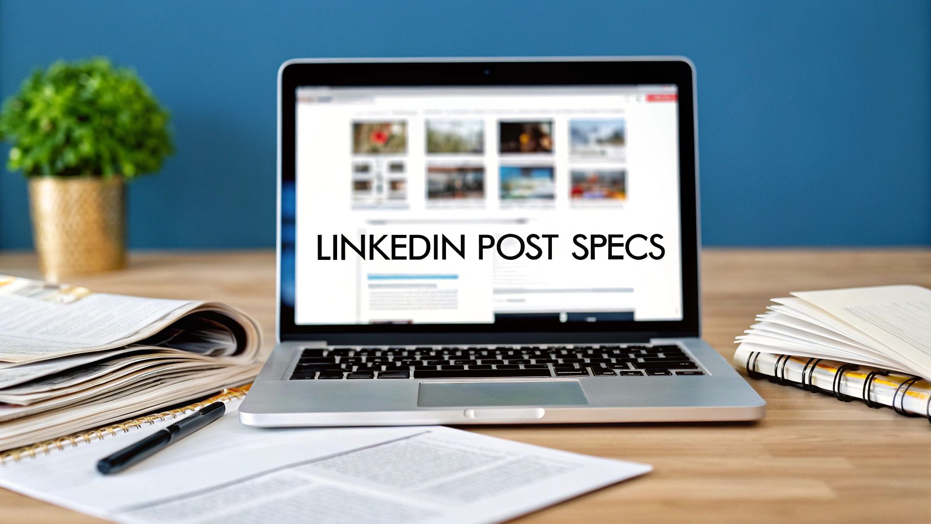
A Guide to LinkedIn Posts Image Size


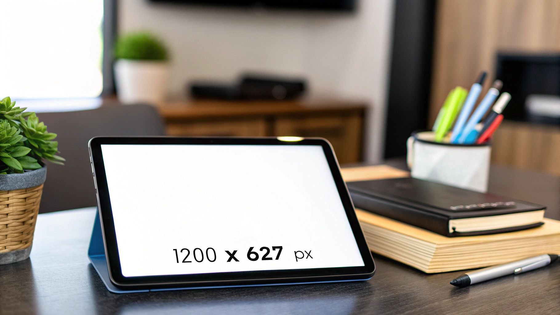
When you're creating a post for the LinkedIn feed, you've got a couple of solid options for image dimensions. For a classic landscape orientation, stick to 1200 x 627 pixels. If you prefer a square image, which performs really well on mobile, go with 1080 x 1080 pixels.
Nailing these sizes is more than just a technical detail; it's about making sure your images look sharp and professional, without any weird cropping that could cut off your message.
Your Quick Reference for LinkedIn Image Dimensions
Getting your image dimensions right on LinkedIn is a simple but powerful way to make a great first impression. An image that's stretched, pixelated, or poorly cropped just looks unprofessional and can cheapen your message. Think of this section as your definitive cheat sheet for creating visuals that stop the scroll and get your point across clearly.
Key Image Sizes to Know
The best image size really depends on the orientation you're going for. Here’s a quick breakdown:
- Square Images: 1080 x 1080 pixels (a 1:1 aspect ratio). These are fantastic for mobile viewing.
- Landscape Images: 1200 x 627 pixels (a 1.91:1 aspect ratio). This is the traditional standard for shared links and horizontal photos.
- Portrait Images: 627 x 1200 pixels. While less common for standard posts, this vertical format can take up more screen real estate, especially on phones.
Using these exact dimensions helps guarantee your images will display crisply across different devices, from a wide desktop monitor to a small smartphone screen.
This chart breaks down just how much of a difference the right format can make on engagement.

As you can see, the data makes a strong case for using properly sized landscape images, which can achieve more than double the engagement rate of posts that have no visuals at all.
For an even deeper dive that covers everything from profile pictures to ad formats, this comprehensive LinkedIn Graphic Sizes Guide is an excellent resource to have on hand. It's a good idea to bookmark these guides so you can always keep your visual content looking its best.
Why Getting Image Sizes Right Matters on LinkedIn
On a professional network like LinkedIn, how you present yourself is everything. Getting your LinkedIn post image size right isn't just a tiny technical detail—it’s a direct reflection of your brand's commitment to quality and professionalism.
Think about it: an image that's blurry, stretched, or awkwardly cropped instantly makes your content look sloppy. It can completely undermine the message you're trying to send. Getting the visuals right is like dressing the part for a big meeting; it makes an immediate, powerful first impression in a busy professional feed.
Better Engagement, Better Visibility
It’s not just about looking sharp. The right image dimensions actually affect how many people see and interact with your posts. LinkedIn's algorithm is designed to promote content that provides a great user experience, and a big piece of that puzzle is visuals that are optimized for the platform.
Correctly sized images don’t just look better; they perform better. We're talking up to 30%-60% more engagement on posts that nail their image formatting. More likes, more comments, and more shares tell the algorithm that people find your content valuable, giving it an extra push.
Nailing the correct LinkedIn post image size is one of those foundational skills for any serious content strategy on the platform. Once you've got this down, you can dive deeper with our guide on growing on LinkedIn with strategies and essential AI tools.
Getting Your Feed Post Image Sizes Just Right
The LinkedIn feed is a busy place. To stop the scroll and get noticed, your image has to be on point. While LinkedIn is pretty flexible, there are three core formats that really perform well, and knowing when to use each can make a huge difference in how your content lands.
Picking the right image orientation isn't just about pixels; it's about strategy. A wide landscape image feels professional and expansive, while a punchy square image is designed for immediate impact on a mobile screen.
As you can see, a well-chosen image grabs your attention right away. It takes up valuable screen real estate and gives people a reason to pause and see what you have to say.
The Three Main Image Formats for Your Feed
Let’s break down the specs and best-use cases for the three main image orientations you’ll be working with on the LinkedIn feed.
- Square (1:1 Aspect Ratio): The sweet spot here is 1080 x 1080 pixels. This format is king on mobile because it fills the screen perfectly without any awkward cropping or forcing users to turn their device. I find it works best for bold graphics, professional headshots, or quick announcements that need to be seen clearly and quickly.
- Landscape (1.91:1 Aspect Ratio): Go with 1200 x 627 pixels for this one. This is the classic format LinkedIn uses for shared link previews, so it has a familiar, professional feel. It's perfect for event banners, group photos, or any wide shot where you want to convey a sense of scope.
- Portrait (Variable Ratios): While you don't see them as often, vertical images can be incredibly effective. A common size is 627 x 1200 pixels. Their biggest advantage? They take up more vertical space in the feed, literally forcing people to stop and look. This makes them fantastic for infographics or any detailed visual that reads better top-to-bottom.
A Quick Pro-Tip: Always, always export your images in high quality. LinkedIn compresses uploads, so starting with a sharp JPG or PNG file ensures your final post looks crisp and professional, not blurry or pixelated.
Choosing the right format is half the battle. If you want to streamline your content creation from start to finish, a tool like this free LinkedIn post generator can help you pair great copy with perfectly sized visuals. When you match the right dimensions with solid content, your posts are primed to perform.
Nailing Your Profile and Company Page Images
Think of your LinkedIn profile and company page as your digital handshake. Before anyone reads a word you've written, they see your images. Getting the dimensions right for these core assets isn't just a technical detail—it's about showing you're credible, professional, and you sweat the small stuff.
A blurry logo or a awkwardly cropped banner can undermine your credibility in a split second. These images are the foundation of your entire LinkedIn presence, so let's make sure they're perfect.
Your Personal Profile Image Specs
Your personal profile is your professional brand headquarters. Keep it looking sharp with these dimensions.
- Profile Photo: The sweet spot is 400 x 400 pixels. This should be a clear, high-quality headshot where your face is easily recognizable. No one wants to squint to see who you are!
- Background Banner: For your banner, aim for 1584 x 396 pixels. This is your personal billboard—a great space to show off your industry, a personal brand statement, or something that reflects your professional personality.
If you really want to get your profile picture just right, diving into the specific dimensions of a headshot can make a world of difference.
Your Company Page Image Specs
For any business, a consistent, polished look is crucial for building a memorable brand. Stick to these specs to keep your company page looking professional and trustworthy.
- Company Logo: Your logo should be uploaded at 400 x 400 pixels. This tiny square follows your brand everywhere on LinkedIn, appearing next to every post, comment, and in search results.
- Cover Image: The company cover banner is a bit different, requiring a size of 1128 x 191 pixels. This is prime real estate to showcase your company culture, a major campaign, or your brand's core mission.
A quick word of advice for any banner image: always design with a "safe zone." Keep your most important elements, like text or key graphics, away from the edges. Banners get cropped differently on various devices, especially mobile, and you don't want your message getting cut off. Always check how it looks on both a desktop and a phone before you call it a day.
Getting Your Images Right for LinkedIn Articles and Link Previews

When you move beyond simple feed posts, you get into sharing long-form content with LinkedIn Articles or dropping links to your own blog. The visuals for these are totally different and, frankly, even more important for getting clicks.
Think of your article header or link thumbnail as the book cover for your content. It's the first thing people see and it's what convinces them to click through. Getting the LinkedIn posts image size perfect here makes the difference between a professional-looking post and a sloppy, auto-cropped mess.
LinkedIn Article Header Images
If you're publishing an article directly on the LinkedIn platform, that big banner image at the top is your prime real estate. It sets the entire tone for your piece before anyone reads a single word.
- Recommended Dimensions: 1200 x 644 pixels
- Aspect Ratio: Roughly 1.86:1
This wide, panoramic format is perfect for a striking photograph, a custom graphic with your article title, or an illustration that captures the essence of your topic. Just make sure it's high-resolution and directly related to what you've written.
Link Preview Thumbnails
Ever paste a link into a post and watch LinkedIn pull a weird, random image from the webpage? You can prevent that. When you share a link to an external site, LinkedIn creates a preview card with a thumbnail image.
- Optimal Thumbnail Size: 1200 x 627 pixels
- Aspect Ratio: 1.91:1
To take control of what image shows up, you need to use Open Graph (OG) tags on your website. Specifically, the og:image tag in your page's code tells social media platforms like LinkedIn exactly which visual to grab. Without it, you're leaving it up to chance, and the platform might pull a tiny logo or an irrelevant ad banner, killing your post's potential.
Common LinkedIn Image Blunders (And How to Fix Them)
Even when you nail the dimensions, a few simple mistakes can really hurt the professional look of your posts. I've seen it happen time and again. Let's walk through the most common pitfalls so you can make sure your visuals always look sharp and get the job done.
One of the biggest culprits is uploading a low-resolution image. LinkedIn has to compress everything you upload, and if you start with a low-quality file, it’s going to end up looking blurry and pixelated. This can instantly make your brand feel amateur. Always, always start with the highest quality image you have and export it as a crisp PNG or JPG.
Another classic mistake is cramming too much text into an image, making it impossible to read on a phone. We’ve all seen them—graphics that look perfectly fine on a big desktop screen but turn into an unreadable mess on mobile.
Quick Fixes for Everyday Problems
The best way to sidestep these issues is to think "mobile-first" and keep your visuals clean and simple.
- Problem: Your text is tiny or crowded on mobile screens.
- Fix: Go with a large, legible font and be ruthless about cutting down the amount of text. Stick to one core message on the image itself and use your post's caption to elaborate.
- Fix: This is an easy one. Just center the most important part of your image—whether it’s a person's face or a product shot—and keep critical elements away from the edges. Think of it as creating a "safe zone" that ensures nothing important gets cut off, no matter the device.
The goal isn’t just to fit the frame, but to make an impact within it. Your image should support your message, not distract from it.
If you find yourself constantly wrestling with image sizes, a free LinkedIn photo resize tool can be a lifesaver. It lets you quickly adjust your visuals before you hit publish.
Common Questions About LinkedIn Image Sizes
Even with a detailed guide in hand, a few practical questions always come up when you're in the thick of creating content. Here are some quick answers to the most common things people ask about getting their LinkedIn post image sizes just right.
What Happens If I Use the Wrong Dimensions?
When you upload an image that doesn't fit LinkedIn's recommended dimensions, the platform's algorithm takes over. It will automatically try to crop or resize the image to make it fit, which rarely ends well.
This usually results in awkward crops that chop off key parts of your graphic or text. Your image might also end up looking blurry or pixelated, which can make your brand look less professional. It's always better to size your images correctly from the start to keep complete control over how your content appears.
Does LinkedIn Support Animated GIFs?
Yes, it does! LinkedIn supports animated GIFs in feed posts, which can be a fantastic way to grab attention in a crowded feed.
Just be sure to keep the file size under 8MB. For the best results, stick to the same aspect ratios you would for a static image, like 1:1 for a square post or 1.91:1 for a horizontal one. GIFs are great, but remember to use them thoughtfully to maintain a professional feel.
How Do I Ensure My Banner Looks Good Everywhere?
The trick to a banner that looks sharp on both desktop and mobile is to design within a "safe zone." Because LinkedIn crops the banner differently depending on the screen size, all your critical information—like your logo, name, or tagline—should be placed right in the center.
Keep important elements away from the top, bottom, and side edges, as those are the areas most likely to get cut off. After you upload a new banner, always double-check your profile on both a computer and a phone to see how it looks.
If you want to speed up your entire content creation workflow, checking out the top AI tools for automating social media posts is a smart move.
Ready to create stunning, perfectly sized LinkedIn content in seconds? With Yooz AI, you can generate engaging posts, carousels, and images that are automatically optimized for maximum impact. Stop wrestling with dimensions and start creating content that gets results by visiting https://yooz.ai today.